

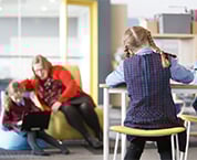


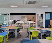
Research into the effect of colours on students in any classroom or learning space has shown that it can have a real impact.
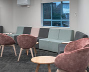
Colours and finishes influence mood, behaviour, concentration, and academic performance. We keep furniture in a wide range of finishes and colours, so let’s take a look at how you can make use of these to influence and assist students, starting with woodgrain finishes.
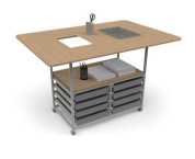
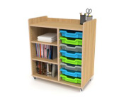
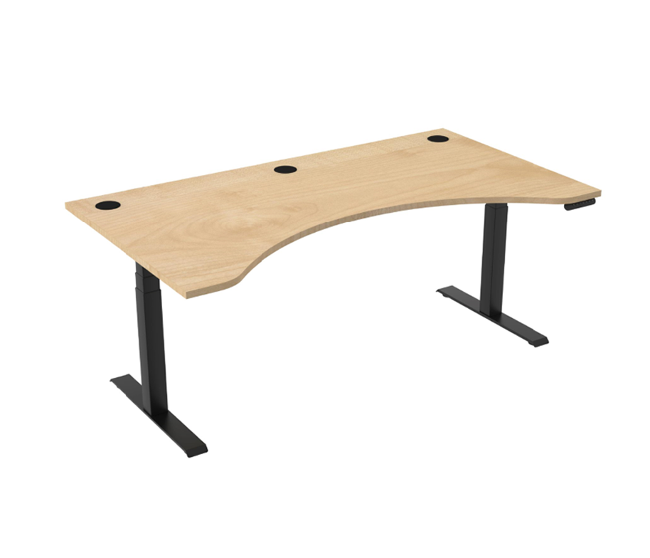
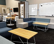
Woodgrain classroom furniture has several positive psychological, aesthetic, and practical effects on students and the overall learning environment. For a start, it creates a warm and inviting atmosphere because of its natural feel. This also helps reduce stress and anxiety, fostering a calm and positive environment conducive to learning.
Woodgrain is what is known as a “Biophilic Design Element” – a term that refers to incorporating natural elements into man-made environments. Because these finishes mimic natural surroundings, they are linked to improved cognitive function, mood, and well-being in students.
They also improve concentration and focus, compared to sterile metal or all-plastic furniture, because woodgrain tones are less visually jarring and overstimulating, helping students focus better.
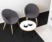
Aesthetically flexible, woodgrain finishes blend well with various colour schemes and classroom themes, and is often associated with quality and stability, giving a sense of permanence and professionalism.
Woodgrain has some noise absorption factors too, as wood-like materials can help dampen noise, contributing to a quieter, more focused learning environment. And because real wood may not be as resistant to wear and tear in a classroom setting, many schools opt for laminate woodgrain finishes for easier maintenance.
Now let’s discuss the main groups of colours and see what effects they have on learning spaces and learning itself.
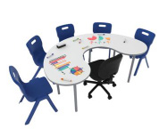
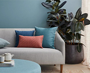
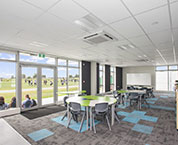
Blue Tones:
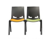
These tones have a calming and soothing effect, that’s best for encouraging focus and productivity.
Blue hues are good for areas where students do independent work or need to concentrate, such as reading corners and study zones.
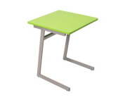
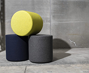
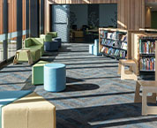
Green Tones:
The green palate is well known for being relaxing and refreshing. By promoting calmness and reducing anxiety, greens are ideal for high-stress environments like exam rooms or classrooms and work particularly well for younger children.
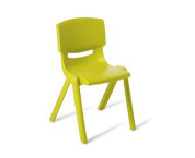
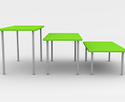
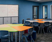
Yellow Tones:
Yellows are stimulating and energizing, and work a storm when it comes to boosting creativity and motivation. These colours are really effective in art rooms, discussion areas, or spaces meant to inspire collaboration.
But – use yellows in moderation, as too much can be overwhelming for some students!
Red Tones:
The reds stimulate energy and alertness but may also cause stress if used excessively. It’s best used sparingly – such as in signs or small accents – for drawing attention to specific areas or signals.
White Tones:
These clean, neutral tones make any space appear brighter. They’re commonly used for walls, but excessive white can make a space feel sterile or uninspiring – so see above to pick out some good accent colours!
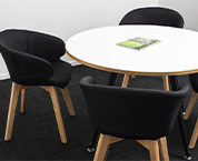
Black & Darker Colours:
While these shades can add a sophisticated look, they’re best used for creating contrast or highlighting specific areas. Darker notes are best used carefully, and in small doses, to create balance.
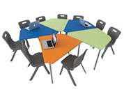
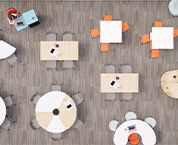
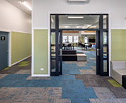
Here are a few general guidelines of how to use colour to make learning and study spaces more interesting through adding vibrancy:
- Balance really is key: a mix of stimulating and calming colours is what works best.
- Age matters: Younger students respond well to bright, bold colours; older students may prefer the softer, more muted tones.
- Lighting influences perception: Natural light can soften strong colours, while artificial lighting might exaggerate them.
- Cultural context: Colour meanings and reactions can vary across cultures, and is something else that should be taken into account.